
Crew sent me a visual made up using regular typeface characters, but they needed the white line thicknesses to be equal throughout and the blue one to match them, the head of the 2 and the tail of the 5 to be brought under control, and everything to align with the Crew brand stripes.
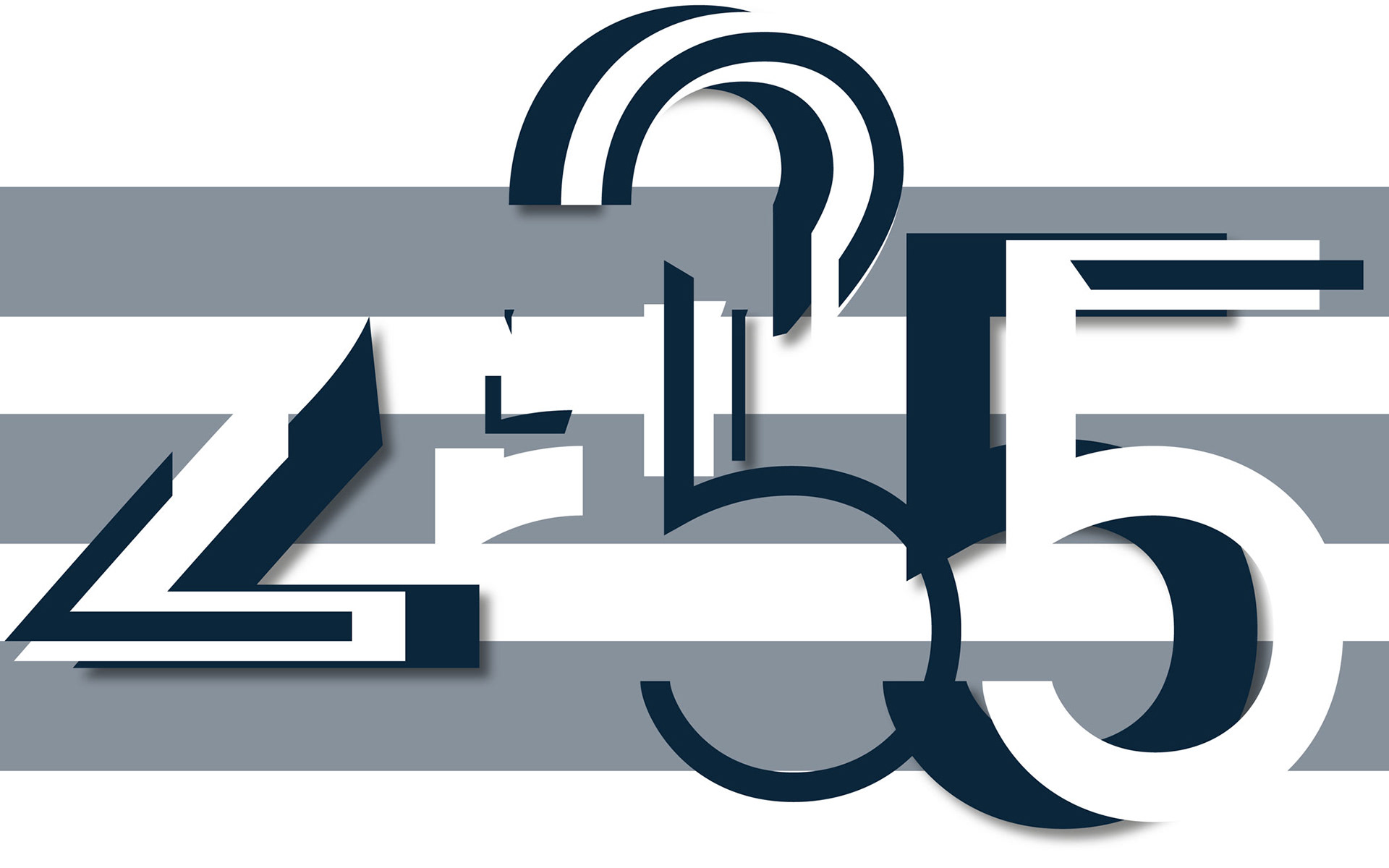
It took a complex breakdown of shapes to ensure the shadows fell exactly as required.

Crew were very happy with the result…

…but went for the simpler version with no shadow after all.